Table of Contents
ToggleTwo tone kitchen cabinets aren’t new, but the blue and white combination has surged in popularity through 2025 and into 2026, and for good reason. This pairing brings depth, contrast, and personality to a space that’s often dominated by all-white or all-wood finishes. Blue adds visual interest without the commitment of a full-color kitchen, while white keeps things bright and balanced. Whether someone’s planning a full remodel or a cabinet refresh, this color scheme works across design styles from coastal to modern farmhouse. It’s also forgiving: mistakes in tone or placement are easier to correct than with bolder, more saturated palettes.
Key Takeaways
- Two tone blue and white kitchen cabinets create visual depth and architectural definition without requiring a complete kitchen overhaul, making the style practical for modern homes.
- Navy blue lower cabinets paired with white uppers is the most versatile and popular layout, as navy hides wear and splashes while white uppers brighten the space and enhance ceiling height perception.
- Choosing the right blue shade—considering undertones, lighting conditions, and how it pairs with white—is critical; test paint samples on actual cabinet doors at different times of day before committing.
- Balancing visual weight using the 60-30-10 rule (60% white, 30% blue, 10% accents) and coordinating hardware, backsplash, and countertops ensures a cohesive two tone blue and white kitchen design.
- High-quality cabinet paint, proper primers, and adequate drying time are essential for a durable painted finish; satin or semi-gloss sheens offer the best durability and easy cleanup in kitchens.
- Factory-finished two tone cabinets from semi-custom manufacturers provide a more durable alternative to field-applied paint while offering flexibility in color combinations.
Why Two Tone Blue and White Cabinets Are Transforming Modern Kitchens
Color contrast creates architectural definition. In open-concept homes, a two tone cabinet scheme visually anchors the kitchen without needing walls or partitions. Navy or cobalt lowers draw the eye downward, grounding the space, while white uppers prevent the room from feeling top-heavy or closed in.
This approach also solves a common design problem: monotony. All-white kitchens can feel sterile or builder-grade. All-blue risks looking dark or dated. Splitting the difference gives homeowners flexibility, they can lean coastal with soft blues, go bold with deep indigo, or stay neutral with gray-blue tones.
From a practical standpoint, darker lower cabinets hide scuffs, splashes, and wear better than white. That’s especially useful around the sink, dishwasher, and trash pullout. White uppers reflect light and make the ceiling feel higher, which matters in kitchens with standard 8-foot ceilings.
Finally, two tone cabinets give DIYers a manageable project scope. Painting or refacing just the lowers, or just an island, is less daunting than overhauling every cabinet in the room. It’s a phased approach that can fit a weekend timeline and a tighter budget.
Best Blue and White Cabinet Combinations for Your Kitchen Style
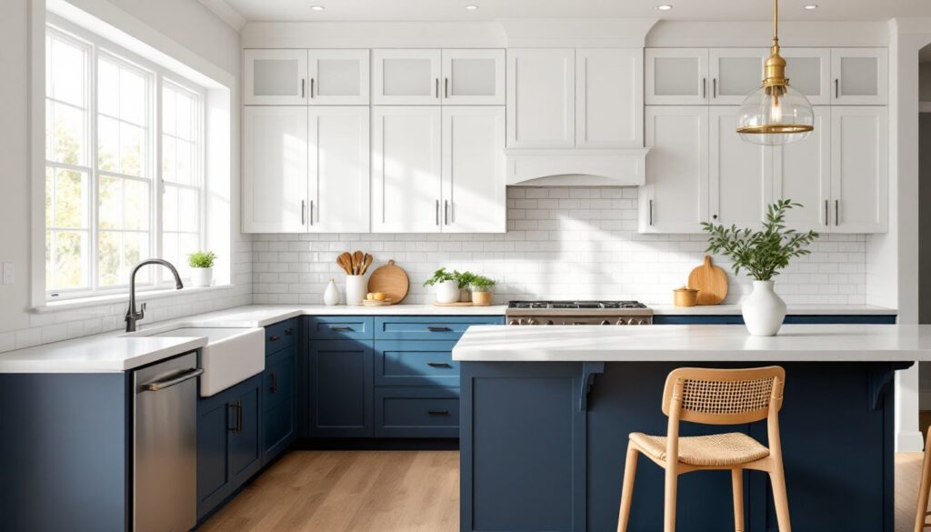
Navy Blue Lower Cabinets with White Uppers
This is the most popular two tone layout for good reason: it’s grounded, classic, and works in nearly any kitchen footprint. Navy blue base cabinets paired with white wall cabinets create strong vertical contrast without feeling busy.
Navy reads as a neutral in most lighting conditions, especially when paired with brass or matte black hardware. It works well with marble, quartz, and butcher block countertops. In farmhouse or transitional kitchens, navy lowers with shaker-style doors and white uppers in the same profile maintain visual continuity.
One thing to watch: if the kitchen has limited natural light, navy can absorb too much brightness. Consider this layout in kitchens with windows on at least one wall, or plan to add under-cabinet LED strips (3000K–4000K color temperature) to compensate.
Tool-wise, if someone’s painting existing cabinets, they’ll need a good bonding primer like INSL-X Stix or Zinsser BIN, especially over glossy or previously finished surfaces. A HVLP sprayer gives the smoothest finish, but high-quality foam rollers and angled brushes work too, just expect more prep and sanding between coats.
Soft Blue Island with White Perimeter Cabinets
This inverted approach keeps the main cabinetry light and uses blue as an accent. It’s ideal for smaller kitchens or spaces where the island is the focal point. Powder blue, sky blue, or pale aqua on the island feels fresh without overwhelming the room.
This combo works especially well in coastal or cottage-style kitchens. Pair it with white subway tile, open shelving, and light wood or white oak flooring. The island becomes a statement piece, and the perimeter stays clean and uncluttered.
A softer blue also makes it easier to swap out accent colors over time. Homeowners can rotate in warmer or cooler tones through bar stools, pendant lights, or textiles without clashing. Design resources like Remodelista often feature this kind of flexible, layered approach in their kitchen galleries.
From a construction standpoint, painting just the island is a solid starter project. It typically involves fewer doors and drawer fronts, and mistakes are more isolated. Use the same prep and priming steps as above, and consider a satin or semi-gloss finish on the island for easier cleaning, it’ll get more contact than wall cabinets.
How to Choose the Right Blue Shade for Your Two Tone Kitchen
Blue is a massive color family. Picking the wrong shade can make a kitchen feel cold, dated, or disconnected from the rest of the home. Start by considering undertones. Blues with gray undertones (like Benjamin Moore Hale Navy or Sherwin-Williams Naval) feel modern and grounded. Blues with green undertones (teal, turquoise) skew coastal or vintage. Pure blues without gray or green read bolder and more saturated, great for contemporary spaces, risky in traditional ones.
Test paint samples on actual cabinet doors, not just walls. Cabinet surfaces reflect light differently, especially if they’re painted versus stained or laminate. Paint a 24-inch square on a lower door and an upper door, then observe it at different times of day. Morning light, afternoon sun, and evening artificial light will all shift the color.
Consider the color temperature of existing finishes. If the kitchen has warm-toned wood floors, a blue with slight warmth (like a slate blue) will harmonize better than an icy, cool-toned blue. Conversely, if the countertops are cool white quartz or marble, a crisp navy or cobalt fits naturally.
Don’t forget the ceiling height and natural light. Darker blues work in kitchens with 9-foot or higher ceilings and good daylight. In kitchens with 8-foot ceilings or limited windows, stick to mid-tone or lighter blues to avoid a cave effect.
Finally, check how the blue reads next to white. Some whites have cream or yellow undertones (like Benjamin Moore White Dove), which can make cool blues look harsh. Pair cooler blues with true whites or slightly blue-tinted whites (like Sherwin-Williams Extra White) for a cohesive look. Homeowners exploring small-space color strategies often reference guides on The Kitchn for practical pairing advice.
Design Tips for Balancing Blue and White Kitchen Cabinets
Balance isn’t just about color, it’s about visual weight. Dark blue cabinets feel heavier than white, so the goal is to distribute that weight thoughtfully. If all the lowers are navy, add white or light-colored open shelving on one wall to break up the mass. If the island is the only blue element, keep it proportionate to the perimeter cabinetry: an oversized island in deep blue can dominate a small kitchen.
Use the 60-30-10 rule as a rough guide: 60% white (perimeter cabinets and walls), 30% blue (lowers or island), and 10% accent color or material (hardware, backsplash, countertop edge). This creates rhythm without chaos.
Hardware and fixtures act as visual bridges. If the blue is cool-toned, brushed nickel or polished chrome maintains that temperature. If the blue leans warmer or has gray undertones, brass or matte black hardware adds contrast without clashing. Keep hardware consistent across both blue and white cabinets for unity.
Backsplash choice matters. A white subway tile or simple white quartz slab backsplash keeps the focus on the cabinets. If someone wants pattern or texture, choose a tile that incorporates both blue and white (like a small-scale mosaic or patterned cement tile) to tie the two tones together.
Countertop selection should balance, not compete. White marble or quartz with gray veining complements both blue and white. Butcher block or light wood adds warmth and softens the contrast. Avoid heavily veined or multicolor stone, it’ll fight with the two tone scheme.
Flooring should stay neutral. Light or medium wood tones, gray luxury vinyl plank, or neutral tile let the cabinets be the focal point. Dark floors can make a blue-and-white kitchen feel too contrast-heavy, especially in smaller spaces.
Materials, Finishes, and Hardware That Complement Two Tone Cabinets
Cabinet material affects both cost and paint adhesion. Solid wood (maple, oak, poplar) takes paint well and stands up to the prep work required for a durable finish. It’s the best choice for painted cabinets, especially if someone’s doing the work themselves.
MDF (medium-density fiberboard) is a budget-friendly option that paints smoothly, but it doesn’t hold up as well to moisture. Use it for uppers or in low-humidity climates, not around the sink or dishwasher.
Plywood with a hardwood veneer is a solid middle ground, stable, paintable, and more moisture-resistant than MDF. It’s common in higher-quality stock and semi-custom cabinetry.
Finish sheen impacts durability and cleanability. Satin or semi-gloss finishes are standard for kitchens because they resist moisture and wipe down easily. Matte or flat finishes look modern but show fingerprints and scuffs, especially on blue cabinets.
For hardware, knobs and pulls should be proportional to the door size. A standard 3-inch pull works on most 18-to-24-inch wide doors. Larger drawers (30 inches or wider) look better with 5-to-6-inch pulls or double knobs spaced 3 to 4 inches apart.
Material and finish matter. Matte black hardware is trending in 2026 and pairs well with both navy and white. Brushed brass or gold adds warmth and works especially well with softer blues. Polished chrome or nickel keeps the look crisp and traditional.
If someone’s painting existing cabinets, they’ll need to remove hardware, clean with a degreaser (like TSP substitute), sand lightly with 150-grit sandpaper, prime with a bonding primer, and apply at least two coats of a high-quality cabinet paint (like Benjamin Moore Advance or Sherwin-Williams Emerald Urethane). Allow 24 hours of cure time between coats and a full week before reinstalling hardware and closing doors firmly. Rushed curing leads to chipping and poor adhesion.
If the project involves new cabinets, factory-finished options from semi-custom lines (like KraftMaid, Diamond, or Wellborn) are worth considering. Factory finishes are often more durable than field-applied paint, and many manufacturers now offer two tone configurations as standard options.